
Why isn't my sign getting more customers?
You probably are looking to order a sign, and have some reasonable doubt as to how effective it will be to spend a lot of money on a sign, or to buy the cheapest sign you can find.
In a nutshell, here are the rules for Making Your Sign Dollars Count.
The Three Zones
The First Rule of Sign Legibility
What exactly are The Three Zones?
Simply put, they are the signs on stores everywhere, divided into who can see them.
Do you know the times you're driving around looking for a store you haven't seen before? You're looking for a sign in Zone 3, the upper part of the store which is visible from a moving car. When you're walking in a parking lot of a strip mall, or walking across the street from the store you seek, you're looking at Zone 2 on the storefront. The Zone 3 is too high and Zone 1 is too low to see generally. Have you ever seen a person walking down the street and craning to look up to find the name of the store s/he's in front of? That's a person who has to look for a sign in a Zone 3 area for what should be a pedestrian-friendly Zone 1 sign placement.
So, what's Zone 1? That's the area in front of a store, or on the sidewalk, which directs pedestrians into their store, or entices passers-by with a sale or special announcement.
Got it? These illustrations should help.
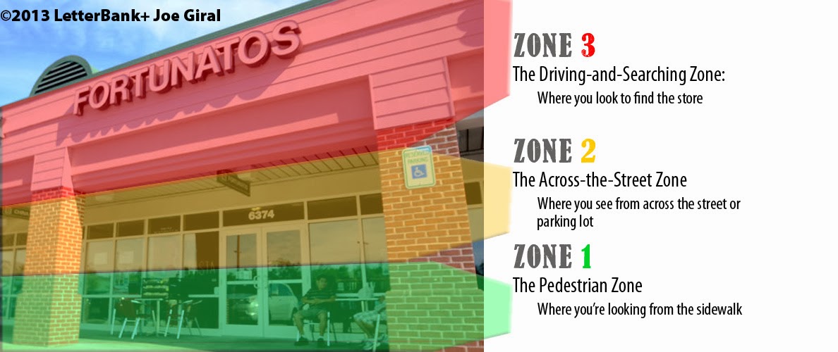
 See the red area? That's Zone 3 for cars driving by,
the orange area is for seeing the business from across the street, and
the green zone is for people in front of the store, who may have no idea of who / what the store name is.
 In a "strip mall", the zones are the same but for slightly different reasons- there aren't too many pedestrians looking for a shop; they park and head towards the shop they went there for.
Still, look at the zones-
They start to make sense the more you think about it.
Now onto Part 2,
The First Rule of Sign Legibility
Ok, maybe this is a silly question, but what is legibility, and why should I care?

Legibility in this case is simply how easy it is to read your sign. Period. Why should this matter? I'm glad you asked : )
Signs range wildly in how easy they are to read. For example, a 'snooty' upscale store might think
 that a gold-on-marble sign with flourishes and obscure typographic design might make them look classy.
Classy is nice, when well-executed, but NOT an easy design to read to understand within the average 3-second attention span of the average American shopper.
Another way to put this is, you have three seconds to catch your customer's eyes. Three seconds. Are you going to spend your money on a fancy sign that's hard to read? Of course, it's your choice, but if you ask for my opinion, go with a good, solid typographically designed sign and forget the scripts and flourishes.
Another extreme side of signage is the plain ALL CAPITAL LETTERS ECONOMY SIGN which saved you a few dollars, but to be honest, does zero (squat) for your business image and zero to entice customers.
Let's take a look at why a "shouting economy sign" is hard to read.
The example below is a real-life example of the sign the economy company "designed" for about $25 less than our typographic design. Any contest? The whole story: The coffee shop owner contacted discount company X, and the owner's wife contacted LetterBank. The husband ordered the ineffective sign on the left, because he could "save" $25. Was it worth it?

The Sign Zone Concept is ©2001, 2013 by LetterBank and Joe Giral, and may not be used without prior written permission from the owner of the copyright.
In a nutshell, here are the rules for Making Your Sign Dollars Count.
The Three Zones
The First Rule of Sign Legibility
What exactly are The Three Zones?
Simply put, they are the signs on stores everywhere, divided into who can see them.
Do you know the times you're driving around looking for a store you haven't seen before? You're looking for a sign in Zone 3, the upper part of the store which is visible from a moving car. When you're walking in a parking lot of a strip mall, or walking across the street from the store you seek, you're looking at Zone 2 on the storefront. The Zone 3 is too high and Zone 1 is too low to see generally. Have you ever seen a person walking down the street and craning to look up to find the name of the store s/he's in front of? That's a person who has to look for a sign in a Zone 3 area for what should be a pedestrian-friendly Zone 1 sign placement.
So, what's Zone 1? That's the area in front of a store, or on the sidewalk, which directs pedestrians into their store, or entices passers-by with a sale or special announcement.
Got it? These illustrations should help.
 See the red area? That's Zone 3 for cars driving by,
the orange area is for seeing the business from across the street, and
the green zone is for people in front of the store, who may have no idea of who / what the store name is.

Still, look at the zones-
They start to make sense the more you think about it.
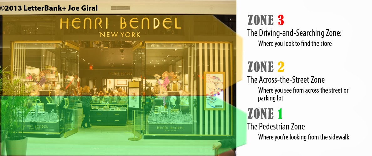
Here is an indoor mall sign, separated into Zones. Note that there is no need for Zone 3, since indoor malls have a limited viewing distance for the potential customers, so signs are generally smaller and lower than outdoor stores.

Now onto Part 2,
The First Rule of Sign Legibility
Ok, maybe this is a silly question, but what is legibility, and why should I care?

Legibility in this case is simply how easy it is to read your sign. Period. Why should this matter? I'm glad you asked : )
Signs range wildly in how easy they are to read. For example, a 'snooty' upscale store might think

Classy is nice, when well-executed, but NOT an easy design to read to understand within the average 3-second attention span of the average American shopper.
Another way to put this is, you have three seconds to catch your customer's eyes. Three seconds. Are you going to spend your money on a fancy sign that's hard to read? Of course, it's your choice, but if you ask for my opinion, go with a good, solid typographically designed sign and forget the scripts and flourishes.

Another extreme side of signage is the plain ALL CAPITAL LETTERS ECONOMY SIGN which saved you a few dollars, but to be honest, does zero (squat) for your business image and zero to entice customers.
Let's take a look at why a "shouting economy sign" is hard to read.
The example below is a real-life example of the sign the economy company "designed" for about $25 less than our typographic design. Any contest? The whole story: The coffee shop owner contacted discount company X, and the owner's wife contacted LetterBank. The husband ordered the ineffective sign on the left, because he could "save" $25. Was it worth it?

LetterBank started as a typographic design company in 1989, founded by Joe Giral. The business LetterBank was originally formed to provide efficient and reproducible good results for graphic artists and designers, you know, the people that business owners would go to, to order a design for their sign.
Now, some people want to save money above all else, and sacrifice the very life of their business to save a few dollars.
Questions?
I'll be glad to answer your questions, or to forward them to someone who can help.
It's people like you, who educate themselves before spending money, that makes the kind of customer we want to have. A smarter customer is our best customer.
The Sign Zone Concept is ©2001, 2013 by LetterBank and Joe Giral, and may not be used without prior written permission from the owner of the copyright.
